Portfolios
Logo Design
Following are logos designed and produced by Active Lightning.
DeFord's Supply
Active Lightning undertook the project to brand a division of DeFord's including the production of this logo. This division supplies maintenance and replacement products to Multifamily Properties and Mobile Home Communities. DeFord's Supply wanted to keep its connection to the parent company's branding.

This logo represents a nod to a vintage look while being current.
Salty Breeze
Turner Ace of Fernandina Beach, FL wanted to be able to sell gifts related to life outside on the Florida coast, so they started the shop.saltybreeze.com website. Active Lightning helped them determine the name of the store as well as doing the branding.

A Fantasy Store Logo
Fantasy, fairies, magic and fairy tales are the setting for the the website: A Fantasy Store.
By The Sword Logo
A sword has always been a part of this company's logo. This logo fits with the high-quality collectible swords, armor, coins, etc. It is attaractive while calling forward the romantic appeal of knights and castles.
Mark Mender Logo
The laurel leaves suggest "winner." This symbol for the Mark Mender brand projects refinement and class versus the previous bold literal logo.
Digital Senders
This was a challenge to represent a business focused around a product that is possibly new to the user and abstract. The tagline we developed adds to the explanation while communicating ease of use.

Allemon's Logo
This is an updated version of their previous logo.
Egyptian Cotton TShirts Logo
Logo needs to look good embroidered on clothing as well as on the website. A pyramid is a strong symbol for "Egypt." The bands on the left suggest sunlight shining on the face of the pyramid.
Smith Farm Stores Logo
Smith Farm Stores wanted to pursue a strong ecommerce presence for workwear, outerwear, and footwear. In addition to this product focus, they still wanted to be able to sell other products online such as toys, animal health supply products, Holland Grills, United States Stove Company products, and Koenders Windmills. We determined that in addition to their primary logo (used throughout their physical store, signage, and trucks), they would have a related derivative logo that demonstrated their commitment and focus to the workwear, outerwear, and footwear products.
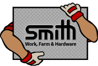
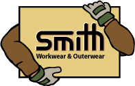
The client's target market includes people who work outside, who have pets and who live on farms. They wanted something that was friendly. They wanted to broaden their image beyond farm-related products while letting people know that their products were built to last. The company identity was described as: professionalism with respect to business management but informal and friendly with respect to customer service. They have an emphasis on relationship and satisfaction. Evidently in Indiana, diamond-plate steel is a common surface associated with ruggedness. So "Smith" is punched out like "Ford-tough" and the diamond-plate steel echoes the ruggedness.
In the second logo, we clothe the arms with a Carhartt jacket. The green accents in the gloves infer the green of outdoors.
Stoughton-Lumber Logo
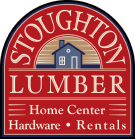
Their company identity was described to us as:
- a store that does business the old-fashioned way with great service
- carrying quality products they stand behind
- special-order desk to help purchase specialty products with next-day delivery
- a one-stop place to shop for products and services to do a building project
| Case Study |
Logo Development Process for Stoughton Lumber
The process for developing the logo for Stoughton Lumber started with a meeting to capture aesthetic and business values from the owner who we worked with on the project, Jim Gerber. The designer on the project was Baker Galloway. So, Jim, Baker, and Sally, met via phone. Out of discussions between Sally and Baker, Baker developed sketches for 3 logo designs. Jim approved the direction, so black and white images were drawn digitally and posted to a webpage where Jim could view them.
Click here to see the logo options in black and white
Jim picked this one:
Then Baker developed color options.
Click here to see the color options for Stoughton logo design
From this, Jim chose this one:

The logo has been very well received and features prominently in the Stoughton Lumber website.
Cox Hardware and Lumber Logo
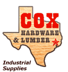
Active Lightning upgraded an existing logo. We like the fact that the gray border and letters abstractly refer to metal hardware; the woodgrain fill for the Texas shape refers to lumber. This logo is a redesign of an original idea conceived by the owner. It conveys Texas pride, western sentiment, while being professional.
Logo Re-Design
Following are logos updated and produced by Active Lightning.
Whitehead Industrial Logo
From:

To:

Miller Hardware Logo
From:
To:

Seasons Logo
From:
To:
